Buttons
Cross Client CompatibilityThe Button Component has been built to be as robust and "bullet proof" as possible and buttons should display accurately in the vast majority of browsers and email clients. The fallbacks have been designed as far as possible with the minimum of compromise, however email standards are constantly shifting and it is strongly advised that you regularly test your designs in as many different places as possible to make sure you are still happy with the results before sending to your customer base.
Fully designed buttons can be added to your designs by dropping in the Button Component.
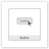
The default styled button looks like the below image. Hovering over the component displays the usual toolbar, including the styles pallet.
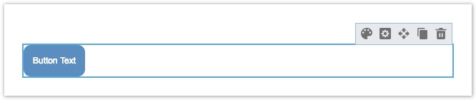
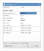
Using the styles pallet you can set the following:
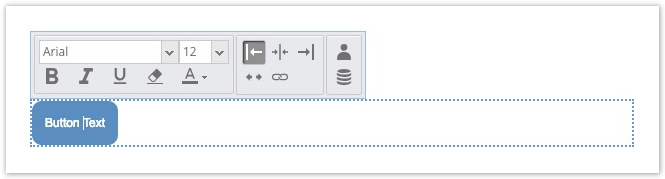
In addition to the overall styles, clicking directly on the button allows you to set the text, link and alignment as well as adjust bold, italic and underline options.
Selecting the fill width:fa-arrows-h: option on the toolbar allows the button to fill the available width of wherever it has been added in the email.
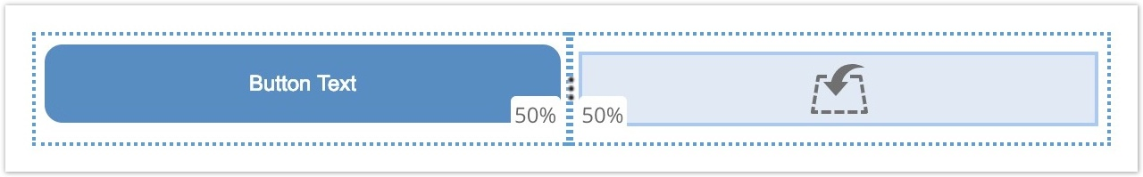
If you would, for example, like your button to fill 50% width then the best option would be to drop in a 2 column structural component and then nest the button within that (setting it to also fill width).
Known Edge Cases (March 2019)Due to the way Yahoo / AOL (and some older versions of Android) render borders, it is possible to create a button which looks like it falls outside of its container in those clients.
If you have a combination of:
- Full width buttons
- With a border applied
Then the button will be larger than expected by the size of the border you set. e.g. a 2px border (left and right) will be a total of 4 pixels wider than the full width of the container the button is in.
What can I do about this?If you know that a significant portion of your engaged recipient base view your messages in the above clients you should avoid adding borders to your buttons.
In most cases it is better to use padding to give the button text space anyway. The only time you should be using a border is if you are trying to create a button which looks "hollowed out". Even in this case you would usually only be adding a subtle 1 or 2 px border and so making the overhang almost not noticeable (and ONLY in these clients).
For any help or advice on this topic you can always contact our Support Team who will be happy to suggest the best way to proceed.