Responsive design
As well as being able to easily create emails using the Email Builder your designs will automatically become responsive on smaller screens.
All default Email Builder templates are designed to automatically adjust their layout when viewed on a smaller screen size.
It is strongly recommended that you preview the mobile version of your emails to check you are happy with the layout before sending them to your recipient list.
You can see the mobile view from either the Content or Preview tabs by clicking the Mobile View or Mobile Preview buttons located at the top of each tab respectively.
If, after viewing the mobile version, you feel you would like to make some tweaks to the mobile design, then read on...
Without making any changes to our initial design, the example below shows our demonstration email as it would appear on a mobile device:
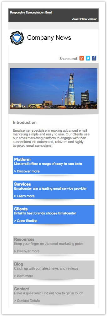
As a first, un-edited, attempt at changing the layout we get a pretty good version of the email.
However, the possibilities within the Email Builder don't stop there.
Maxemail's Email Builder gives you a few ways to further adjust how the content will be displayed when viewing the email on a smaller screen, covered in the following pages: